Pictures and content are subjected to copyright protection
Award Winner 2020
Dean MacMorris & team of Night Light Inc.
Lombard, IL, USA
This beautiful photo won two separate awards—one for the Awe category of Affective Lighting Design and one for the Landscapes/Plantings of Landscape Lighting Design.
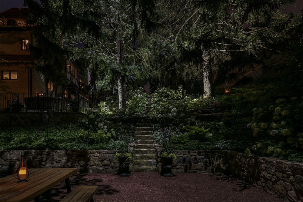
The ELLI Design Critique Study will discuss the photo in terms of what is captured by the photographer within the space or landscaped setting. The first part of this study will address the scene’s composition, as it relates to the lighting applications applied by the designer. The second part will address the ‘affective’ value of the setting—the “experience” or feel of the space.
Before we begin this study, I want to re-introduce the word, “Observation”, as this is an important part to our becoming better lighting designers. When one first views this scene they might pass it over because they just think…plants, trees, and an open sitting area. But, if you truly observe the subtleties within this lighting design and scene, you will experience so much more. Through this critique study, you’ll better understand what it is that exists in this setting.
Let’s dig in…the first step to understanding a ‘good’ design is gained by analyzing the principles of composition. These principles are balance, contrast, emphasis, pattern & rhythm, unity, and movement. Each of these provides a measure to the whole of the scene.
Balance
Balance is the visual interpretation of gravity within the designed space. If the work shown is balanced, then the visual weight will be distributed evenly across the composition. These thoughts can be applied to the design of the landscape as well as to the lighting design.
There’s a strong form of symmetrical balance in this setting, as you can see the stone stairs as the center of the space, aligned by equal or similar forms (trees, plants, and stone walls). If we look at the visual weight between the two-story home, the large Cedar trees, the length of stone stairs climbing the hillside, and the overall elevation change, it seems very balanced and to scale. Additionally, there’s a close balance between hardscape and softscape elements when looking at everything.
When we look at the balance of light and dark, we find a similar result—a balanced expression. I particularly love the leaf shadows spilling down the rock walls and onto the lower sitting area by the downlighting high in the trees.
Contrast
Contrast can be viewed in two ways, the first by the arrangement of opposite elements (light and dark, rough and smooth, large and small, etc.), and the second by the difference in luminance or color, which makes an object distinguishable. Landscape lighting usually works with two forms of contrast: light-dark and cold-warm contrast.
If we first look at light-dark contrasting elements, we see most of the light concentrating on the stairs, trees and plantings aligning the stairs—this is primarily in the mid-ground of the scene. The darkness comes from the lesser amounts of light at the residence, the lower sitting area, and the far distant aspects beyond the top of the stairs.
Analyzing the cold-warm contrast, we find some added interesting elements. Dean and his design team utilized a cooler color of white light (close to 5000K, which provides added blue), which provides a very interesting and cool look to the setting. You can slightly see this on the plantings with the soft pools of light spilling down and dissipating into darkness. And to contrast this, they utilized a couple of very warm colored candle lanterns for interest and pop. You should notice that these warm colored lanterns match the warm glow of the interior house lighting—an excellent enhancement and/or balance to the space.
This space is dominated more by coolness versus warmth. This lighting design shows us that it doesn’t take a lot of countering warmth to provide comfort. There are a lot of greens, grays, and earthy tones, so these need to be countered in some way with a warming element—the candle lanterns and house lights, do this.
As you can see, Balance and Contrast tend to share several of the same characteristics.
Emphasis
The emphasis of a scene is the same as its focal point. Typically, it’s an object or area that draws attention, as it is set apart against its surrounding.
I’d like to point out what Night Light did with this scene and its emphasis. You should note the interesting and effectual approach they provided by not focusing in on any single element. By doing this, they allowed for the space to open up to the whole of the setting. The emphasis is placed upon the stairs and the two large Cedar trees. So, when one views this scene from below and looking up the stairs, it captures the large trees. The viewer is left to experience something bigger, which we’ll discuss in the ‘affect’ section below. This view from below is impressive and grand.
Pattern & Rhythm
A pattern is a combination of elements or shapes repeated in a recurring and regular arrangement. Rhythm is a strong, regular, repeated pattern, and it has a feeling of organized movement. Typically, a pattern can lead the eye towards a destination point. It should be understood that it can be used to lead the eye towards an emphasis.
There are two distinct patterns that stand out in this scene. There’s a pattern in the rock walls—it provides a strong horizontal definition in the landscape and it gently repeats as the elevation climbs. We also see semi-circular rocks in these walls, side-by-side, which is an internal pattern. The second strong pattern is the horizontal steps leading up the face of the hill. Not only is this a horizonal form, but it is straight and provides a strong vertical pattern to match the tree trunks.
If you look at these patterns, as a whole, they seem to balance out between horizontal and vertical, so it feels comfortable to the viewer. It also is easy to understand—it makes sense.
Unity
Unity occurs when the elements of the space work together in such a way that the resulting look is balanced and in ‘harmony’. If we consider our initial thoughts when viewing the scene, then we shouldn’t have any questions, confusion, or unrest with our thoughts as we view a scene. Everything should feel comfortable.
As far as Unity is concerned here, everything works incredibly well together to make the space act in harmony. There are really no questions.
Movement
Movement is the impression of action in one’s work. Visual movement is dependent on the other principles of composition, as well as the movement of the viewer’s eye when experiencing the space. Does the eye jump from one area to the next, in somewhat confusion, as if searching for understanding, or does it rest calmly at the emphasis of the space?
I’ve already made mention of the Pattern & Rhythm of both the horizontal and vertical elements shown by the stairs, walls, and trees. These elements provide Movement, as the eye is attracted to them and follows them towards the center and up the hill. This landscape and lighting design work excellent together because this movement leads the eye to the Emphasis.
‘Affect’
This is the second part of this critique study, and in my opinion, the most important quality for a landscape lighting designer to achieve—the “experience”. Affect relates to emotion and what emotional state is evoked as the viewer experiences the space.
The most exciting part of any lighting design is how it can affect mood and one’s emotional state. I found this setting and scene to be very powerful, not only by how the compositional principles were expressed, but by the ‘affect’ it created. In my opinion, it developed the sense of Awe because the scene opens up to the beyond, and to the tops of the trees. As the space feels extended or limitless, then we, as humans feel small—herein lies the powerful feeling of awe and wonderment.
There are a couple of powerful things taking place with this stairway. If we look at the lighting alone, we see a good amount of light towards the bottom part of the stairs. As we move up the hill, it becomes more shadowed before we reach the mid-ground, upper part of the stairs, and the light comes back into the scene. And then after this area, the light diminishes again at the top. However, at the top, there’s a soft, gray glow that is actually the sky and background acting as a portal or doorway to another unknown part of the property.
Many lighting designs will provide stronger light to these types of backgrounds—to lead the eye. This design does not. This act provides an element of Mystery or Intrigue. And to enhance this feeling, the overgrown flowering plants in this mid-region, adds more mystery to the stairway, the higher it goes. I love this.
Overall, darkness and shadow are experienced slightly more than light, and this stimulates the experience. The blue-white downlighting provides a colder feeling, as well. As mentioned above, the warmth of the candle lanterns and home provide the needed color to make the space feel safer, and pleasant. These additions were excellent to provide for the mood and experience.